


Seasons of Smiles unveils a fresh new identity
Seasons of Smiles unveils a fresh new identity
Seasons of Smiles Dental Clinic has entered a new chapter in its institutional history with the launch of its renewed visual identity. This change is not merely an aesthetic update, but a clear positioning strategy aimed at strengthening its connection with patients and projecting a modern, cohesive, and distinctive image within the dental sector.
The redesign process is grounded in a fundamental premise: to improve the visual clarity of the logo and better communicate the message the clinic aims to convey. As detailed in the brand identity manual, the new corporate image emerged from the challenge of achieving a clearer and more contemporary representation of its values—without losing the essence that has defined the brand over the years.
The previous logo already incorporated the concept of the seasons as a distinctive element of Dr. Norman Medina’s clinic since its founding, symbolizing the continuity of dental care—and, consequently, healthy smiles—throughout every day of the year. In this new phase, that idea is preserved and strengthened, integrating it more directly with the universal symbol of dentistry: the tooth.
The concept: Consistent care all year long
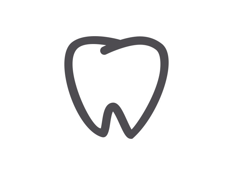
The new identity is built around a central concept: ongoing oral health care. The main symbol features a tooth divided by icons representing the four seasons—spring, summer, autumn, and winter—visually conveying that dental care should be consistent, 365 days a year.
The seasons symbolize the cycles of life’s renewal; in the same way, the clinic promotes the continuous renewal of oral health. A smile is understood not merely as an aesthetic outcome, but as an expression of well-being, security, and confidence.
This conceptual approach projects the clinic into the future, differentiating it within the market and strengthening its positioning as a space that combines professionalism, warmth, and continuity of care.
A strong brand architecture
The new visual identity is composed of three fundamental elements:
Isotype: the tooth symbol with the seasonal icons.
Logotype: the typographic composition featuring the name “Seasons of Smiles.”
Imagotype: the integration of symbol and text into a cohesive unit.
The typographic design is based on the Baloo Thambi typeface for the primary elements, complemented by Lato as a secondary typeface for supporting text. This combination conveys modernity, legibility, and approachability.
Additionally, the brand manual precisely defines the geometric construction of the logotype, its proportions, clear space, color variations, and approved applications, ensuring consistency across all brand touchpoints.
Colors that convey trust and modernity
The official color palette primarily consists of a turquoise blue (Pantone 16-4834 TPX Bluebird) and a deep gray (Pantone 19-3901 TCX Magnet), colors that convey professionalism, serenity, and stability.
These colors are not only applied to the logotype but also extend to corporate stationery, uniforms, exterior signage, company vehicles, the website, and seasonal campaigns, creating a cohesive and comprehensive visual experience.
An identity designed for all touchpoints
The new brand has been developed according to clear technical criteria: monochromatic versions for special applications, minimum size specifications to ensure legibility, strict usage guidelines to prevent distortion, and directives for implementation in photography, outdoor advertising, and promotional materials.
From business cards and corporate folders to uniforms and exterior signage, each element reinforces visual consistency and strengthens the clinic’s brand recognition.
More than a visual change: the beginning of a new chapter
With this renewal, Seasons of Smiles not only updates its image, but also reaffirms its commitment to dental excellence. The new logotype represents a clinic that evolves, understands life’s cycles, and supports its patients at every stage with professionalism and warmth.
The smile, as a universal symbol of well-being, now has a visual identity that supports it throughout the year.
Because dental care is essential in every season of the year.
Corporate Identity of the new logotype:
Related posts


Write a Comment